An Introduction to Regression Analysis.
Regression analysis is a mathematical technique that is used to find trends in data. It is a very useful tool for interpolating calibration data to find values that lie in between calibration points.
1. Introduction
The science of experimental physics can be described as "...putting something IN, and then observing what comes OUT".
If we continue with our back-to-basics approach, we could also say that, in general, calibration procedures fall into one of only two categories:
| Set the parameter being measured to a nominal value. Then record the value indicated by the device under calibration. At the same time record the same value as measured by a more accurate device with a traceable calibration. Then repeat this action for a number of points over the desired calibration range. | |
| Apply a known input, or stimulus, to the device and measure the resulting output using a calibrated reference instrument. Repeat over the calibration range of the device. |
Imagine that you perform a calibration on a device and take 20 measurements.
For each point, you record the output from the device and the actual value of the parameter being measured. To obtain the actual value, you will have used a reference instrument with a traceable calibration and hence defineable accuracy (often referred to as a "Standard"). Here are some examples:
* Strain gauge output in mVolts and actual applied load in kg
* Platinum resistance thermometer indication compared to an NPL traceable device
* Pressure transducer output compared to a traceable reference pressure indicator
* Autoclave setting and temperature as recorded by a reference thermometer
The results of our calibration are shown in tabular form below:
| Measured X | Actual Y |
| 1 | 1 |
| 2 | 4 |
| 3 | 9 |
| 4 | 16 |
| 5 | 25 |
| 6 | 36 |
| 7 | 49 |
| 8 | 64 |
| 9 | 81 |
| 10 | 100 |
| 11 | 121 |
| 12 | 144 |
| 13 | 169 |
| 14 | 196 |
| 15 | 225 |
| 16 | 256 |
| 17 | 289 |
| 18 | 324 |
| 19 | 361 |
| 20 | 400 |
The data, as it stands, can be of value to other people. For instance it can be used as a look-up table to obtain the output value for a given input, or to determine what input is needed to produce a required output.
However, presenting the information in this way produces a big question:
 |
I know the value of the output (Y) when the measured value (X) is 9.0.
I also know the value of Y when X is 10.0. How do l obtain a value for Y when X is 9.5, or 9.2, or, in fact lies between ANY 2 data points (known as "INTERPOLATION"). |
We'll now look in to this so read on.....
2. Displaying Data in Graph Form
A quick, simple and, it has to be said, effective, way of achieving this is to plot the calibration data on an x-y graph. Just by using your eye, a ruler, or a set of french-curves, you will be able generate a line that indicates the relationship between the data points. The line, which is known as a "trend line", will, if drawn with care, be a surprisingly accurate representation of the data points.
Seeing a graph will also illustrate to you a very important characteristic of eye-brain coordination, namely that when it comes to detecting trends, you will do so much better using a graph than a table of values. Any deviation from a smooth x-y relationship is immediately detected by looking at the graph. The same cannot be said when you look at the table of values.
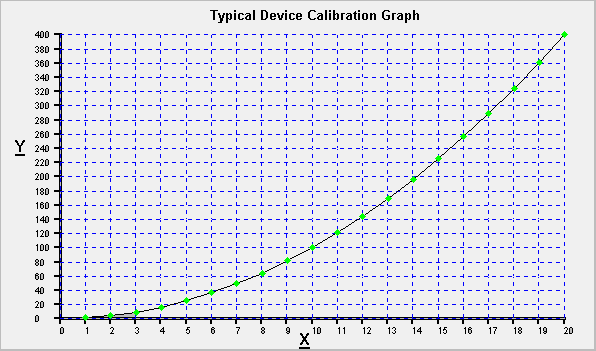
Shown below is the data from our calibration, plotted as an x-y graph by Calibration Toolbox ADO.

Someone with a copy of this graph can quickly an easily read off data points and interpolate between them. But there are still questions to be answered:
 |
Everything if fine when ALL the data points follow a smooth line or curve. However, in the real world, this hardly ever happens. So how do l know (or, more importantly, how do l convince others) that the line l have drawn represents the best possible fit to the data? |
 |
Reading a graph, and in particular, interpolation is prone to human error. Dont you think that a mathematical relationship between my measured and actual values would be better? |
 |
How do l obtain that from my hand-drawn graph? |
All of which leads us on to the subject of:
3. Regression Analysis
Regression Analysis is a statistical technique that produces a line or curve of known function (equation) through a series of data points. The average of all the distances from each point to the curve/line is minimised. In other words, the line drawn through is the closest mathematical relationship to the data, or as it is known, a line of "best fit".
The most common type of regression is where a straight line is drawn through the data points. This is known as "Linear" or "First Order" regression. The line generated will be of the type:
|
y = Cx + D
Where:
|
A person given the values of C and D for the line of best fit can calculate for themselves the value of y for ANY given value of x and vice-versa. Hewre are some examples:
Example 1:
You are given the following values: C = 1.8 and D = 32.
What is the value of y when x = 20.
Inserting the values of C and D into our expression gives:
y = 1.8x + 32
So, when x = 20 we get:
y = (1.8 * 20) + 32
y = 68
Example 2:
Using the same values of C and D i.e. C = 1.8 and D = 32.
What would be the value of x when y = 84.
Again, inserting the values of C and D into our expression gives:
y = 1.8x + 32
So, when y = 84 we get:
84 = (1.8 * x) + 32
x = (84 - 32) / 1.8
x = 28.89
The examples chosen are actually conversions between temperatures expressed in Celsius and Fahrenheit.
Calibration Toolbox ADO users need not worry about having to determine the values of C and D by hand. All of this is performed automatically by Toolbox's built-in functions.
Conversions of this type are obviously very useful, but the picture is incomplete unless the person given the values of C and D is also made aware of exactly how closely the data fits the line.
By this we are not talking about how good a job your eye and ruler (or software) does of putting the best line through the data points, any problem here is a mistake in the interpretation of the data. What we are actually concerned about is the dispersion of the data points around our line of best fit, and hence, how well the data can be represented by a trend line of known function.
The statistical method of expressing the magnitude of this dispersion is called "CORRELATION".
4. Correlation
The number that we use to quantify the quality of a curve-fit is known by a few fancy names, such as the Pearson Product Moment, but we shall refer to it as the "CORRELATION COEFFICIENT". Its calculation is beyond the scope of this page, it suffices to say, that Calibration Toolbox ADO, our calibration management software, seamlessly performs these calculations for you, and has all the tools you need for further Regression Analysis. Its purpose though is this:
The value of the CORRELATION Coefficient quantifies the strength of any mathematical relationship that might exist between x and y.
There 3 types:
| Type | Description | Example | Range |
| Positive Correlation. | Increasing x causes an increase in y. | Daytime temperature and the number of ice-creams sold. | >0 to +1 |
| Negative Correlation. | Increasing x causes a decrease in y. | Your average speed and the the time it takes you to get from A to B. | <0 to -1 |
| Zero Correlation. | No definable relationship. | The number of people under 6 feet tall in London, and the price of fish in Hong Kong. | 0 |
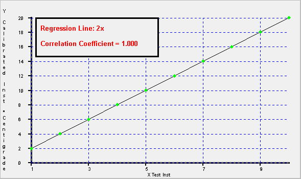
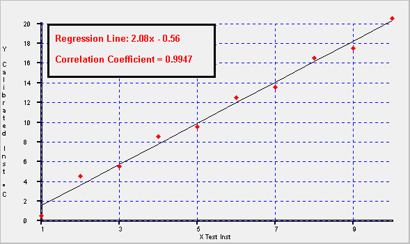
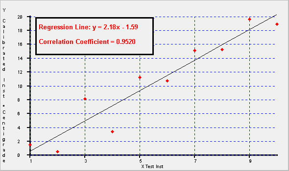
Have a look at the three graphs below that were produced using Calibration Toolbox ADO. They will help you to appreciate the concept of a line of "best fit", and how the correlation coefficient indicates the level of dispersion of the data points around the line


Now have another look at the three graphs and note the following:
| The bigger the dispersion of the data points, sometimes referred to as "Scatter", the more difficult it becomes to draw the line of best fit by hand. | |
| The higher the level of scatter of the data points, the lower the correlation coefficient becomes. The level below which the correlation becomes unacceptable varies from one calibration procedure to another. It will also depend on the types of data being analysed, and its intended usage. On the first graph, the data is a perfect match, and hence the Correlation Coefficient is 1.0. | |
|
The next point is mainly for Calibration Toolbox ADO users.
The three graphs were produced automatically using Calibration Toolbox ADO's Regression Analysis tools. As you can see, the data points on the first graph are shown in green, whereas the data points on the other two are shown in red. This is because Calibration Toolbox ADO has the facility to apply a user-definable tolerance band to the regression results, and if the regressed data point lies outside the band, the point is shown red and green if it is inside. |
5. Higher Order Regression Analysis.
Not all data is best represented by a straight line, for example, the area of a circle is a function of the square of its diameter and not the diameter itself.
This not a problem because Linear Regression is not the only type of Regression Analysis. Higher orders of regression allow us to find more complex relationships between x and y. Listed below are the types of analysis offered by Calibration Toolbox ADO:
| Order | Equation |
| First Order |
|
| Second Order |
|
| Third Order |
|
A, B, C, and D are known as the "Regression Coefficients" where:
* A is the third order coefficient
* B is the second order coefficient
* C is the first order coefficient
* D is the zeroth order coefficient, or "constant"
Orders higher than 3 are also possible, but are not used by Calibration Toolbox ADO. This is because third order regression is more than capable of providing accuracies that are within the requirements of experimental measurement.
Furthermore, each increase in regression order has a corresponding increase in the minimum number of data points that need to be supplied by the calibrator. Calibration Toolbox ADO is designed to save you work, and not make extra work for you.
6. Selecting the Best Regression Analysis Order to Use.
In some cases, external circumstances will require you to perform linear regression for example:
* SCADA or data acquisition systems that convert raw data into engineering units
* Linear amplifiers for strain gauges or accelerometers which require calibration of their offset and gain
Otherwise, use the highest order of regression available for the number of data points you have or are required to produce. All regression software tools worthy of merit will produce a line of best fit, even if that line is generated using a lower order of regression than the one chosen by the user. The software will do this by forcing any unwanted coefficients to zero.
Going back to start of our discussion, Calibration Toolbox ADO was asked to perform a third order regression on our 20 calibration points. The results were:
* Coefficient A = 0
* Coefficient B = 1
* Coefficient C = 0
* Coefficient D = 0
* Correlation Coeff = 1.0000
In other words, although Calibration Toolbox ADO was asked to perform up to third order regression, it found and reported a perfect second order match, y = x(Squared).
You might also like to know that, using Calibration Toolbox ADO, the whole process, which involved data entry and the calculations, took less that 2 minutes including printing a new calibration certificate and graph.


